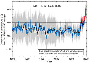
Here we go.

For now we don’t need more detail than this overall view. It is the graph made famous by Al Gore’s An Inconvenient Truth. It was also a defining feature of the IPCC 2001 climate report.
Why is it such a big deal? I think it is because it tells such a clear and simple story. It says:
over the past millennium the global climate has been pretty stable… until about a hundred years ago. Since then it has shot up well above levels seen in more than 1000 years. It represents the best of scientific knowledge, a consensus among world leaders in this field of study.
The audience of this message became… everyone.
It turns out that things aren’t so simple. The graph is inaccurate. That was proposed by Stephen McIntyre and Ross McKitrick.
Before we start to look at the arguments for or against the graph, let’s see how the critique is framed. McIntyre uses a model that positions the hockey stick graph: the Bre-X fraud of the 1990s. The Bre-X fraud was the biggest mining scandal of all time. Briefly (and sorry for the simplification), a mining company reported that it was sitting on the biggest gold deposit ever found, at a site in Indonesia. An independent company estimated the the apparently huge resource, and the share price shot up. Could $20million exploration investment, 2 years work by 15 geologists and 7 drill rigs be wrong? Few were skeptical. But eventually the fraud became clear and the stock crashed. Now the model of Bre-X is not used directly – he is not saying that the hockey stick represents fraud. Rather, it is simply juxtaposed: see, this kind of thing happens, in our world, in our time. Don’t be fooled again – check before you invest!
That’s the way we build project paradigm – the mental model keeps the project on target. Which is interesting to keep in mind as over future posts we look through the comings and goings of the debate over the graph.
The other way I’d like to frame the exploration is through the story that the graph tells. There is double potency in that simple story, presented by an authoritative group. It is potent because it can convey a message very powerfully to a wide public (as it has). However, the other side of that potency is the strength of disillusionment that it makes possible. It becomes a powerful skeptical weapon if doubt is cast on the science behind it. The big message for a skeptical public can be:
if the scientists can’t be trusted with such a simple message as this, how can they be trusted with the more difficult and subtle parts of the climate argument?
Hmm. We shall see.
0 Responses to “the hockey stick graph #1”